Introduction
As JavaScript developers at zen8labs, we are constantly bombarded with new languages, tools, and technologies, making it challenging to decide where to focus our efforts. Should we enhance our TypeScript skills? Dive into Svelte? Or prepare for the future with WebAssembly? The options are overwhelming.
Despite the ever-expanding list of technologies, I believe that investing time in mastering CSS offers substantial returns. While it may seem like an unconventional choice, improving my CSS skills has significantly benefited my career and development capabilities. In this article, I’ll refresh your CSS knowledge and outline the key fundamentals of this essential language.
Language fundamentals
You don’t need to memorize every CSS property and value because there are excellent resources like MDN Web Docs and W3Schools for quick reference. However, understanding some key fundamentals of CSS is essential. Without these basics, making sense of CSS can be challenging. Taking the time to grasp these core concepts will save you a lot of time and frustration in the long run.
Beyond class: Exploring the CSS selectors
A selector does exactly what it implies: it selects a part of your document so you can apply CSS rules to it. While many are familiar with using classes or styling HTML elements directly (body), there are numerous advanced selectors like attribute selector, Pseudo-classes, combinators, … Here are some key types of advanced selectors and how to use them:
/* Select all input elements with a type attribute of 'text' */
input[type="text"] {
    border: 1px solid #ccc;
    padding: 5px;
}
/* Select every section that has an h2 element */
section:has(h2) {
    border: 1px solid #ccc;
    padding: 10px;
}

/* Select all paragraphs inside articles or sections */
:is(article, section) p {
    font-size: 1.1em;
    margin-bottom: 10px;
}
You can find further reading materials on MDN
The cascade, specificity and inheritance
The cascade determines which rule takes precedence when multiple rules could apply to a single element. If you’ve ever been puzzled by CSS that doesn’t seem to work, the cascade is likely the culprit. The cascade is closely tied to specificity, which dictates which selectors prevail when multiple selectors target the same element. Additionally, inheritance plays a role, defining which properties are passed down to child elements from their parent elements.
Understanding the cascade
The cascade is a process that combines different CSS rules to determine the final styles applied to an element. The order of rules, specificity, and importance all contribute to this process. The general rules for the cascade are:
- Importance: Rules marked with !important take precedence over other rules.
- Specificity: More specific selectors have higher priority.
- Source Order: When rules have equal importance and specificity, the latter rule in the source order takes precedence.
Specificity in detail
Specificity is calculated based on the types of selectors used. A higher specificity selector will override a lower specificity one. The specificity calculation follows this pattern:
- Inline styles (added directly to an element in the HTML) have the highest specificity.
- IDs have higher specificity than classes, attributes, and pseudo-classes.
- Classes, attributes, and pseudo-classes have higher specificity than elements and pseudo-elements.
#Note: That’s why using !important is a negative approach. It can cause undesired effects further down the line as it breaks all the rules and overrides the natural flow of the cascade.
Inheritance
Inheritance allows child elements to inherit styles from their parent elements, but not all properties are inherited. Typically, properties related to text and font are inherited, while box model properties (margin, padding, width,…) are not inherited.
#Note: To get an understanding of all of these things, I would suggest reading The Cascade and Inheritance, in the MDN Introduction to CSS.
If you are struggling to get some CSS to apply to an element, then your browser DevTools is the best place to start. They provide tools to inspect the applied styles, view the cascade, and troubleshoot issues with specificity and inheritance.
The box model
Everything displayed on the screen has a box, and the Box Model describes how the size of that box is calculated. This takes into account margins, padding, and borders.
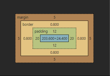
The standard CSS box model
In the standard CSS Box Model, the width you specify for an element is just the content width. Any padding and borders are added to this width, making the total space taken up by the element larger than the specified width.
/* Standard Box Model */
.box {
    width: 200px;
    padding: 20px;
    border: 10px solid black;
    margin: 20px;
}
In this example, the total width of the box will be:
- Content width: 200px
- Padding: 20px (left) + 20px (right) = 40px
- Border: 10px (left) + 10px (right) = 20px
- Total width: 200px + 40px + 20px = 260px
The alternative box model
CSS introduced an alternate Box Model, known as the box-sizing property. When you set box-sizing: border-box;, the given width of the element includes the padding and border, making the element’s total width equal to the specified width.
Example:
/* Alternative Box Model */.box {
    width: 200px;
    padding: 20px;
    border: 10px solid black;
    margin: 20px;
    box-sizing: border-box;
}
In this example, the total width of the box will be exactly 200px, as the padding and border are included within the specified width.
Why use box-sizing: border-box?
Using box-sizing: border-box can make layout design more intuitive and manageable. When you specify the width of an element, that width will be the total width, and any padding or border will be inside this width, making the content fit neatly within the element’s dimensions.
#Note: Browser DevTools can be incredibly useful for understanding the box model in use.
Layout modes in CSS
When it comes to layout, CSS is more like a collection of mini languages than a single cohesive language.
Every HTML element will have its layout calculated by a layout algorithm. These are known as “layout modes”, and there are 7 distinct ones (Positioned layout, “Flexible Box” layout (AKA Flexbox), and Grid layout (AKA CSS Grid), Float layout, Table layout, Multi-column Layout and the default layout Normal Flow (Block and Inline layout)).
Each layout mode will have its own rules for alignment, element direction and algorithms to calculate the element sizing.
For example, the default layout mode is the Flow layout. A plain HTML document, with no CSS applied, uses Flow layout exclusively. It has 2 main types are Block and Inline. We can change it through the display property. Each HTML tag has a default type. <div>, <header> are block elements, <span>, <a> are inline elements. Each type in the flow layout will come with its own behaviour.
For alignment and direction. The flow layout will lay the children from left to right, top to bottom
For sizing: When you place a block level element on the page, its content box greedily expands to fill the entire available horizontal space, about height, the default values will be auto and it will equal to height: fit-content. But for the inline element, it just sits exactly where they’re assigned (That’s why you can’t apply width/height property for inline element, it will have no effect!).
For more information about CSS layout mode, you can follow this resource
Each mode offers unique capabilities, allowing developers to choose the best tool for the job and create versatile, robust layouts. That’s why understanding these layout modes and their specific rules is crucial for creating effective and responsive web designs.
Conclusion
CSS is a powerful language that significantly impacts web development. By understanding its fundamentals—like selectors, the cascade, specificity, inheritance, and the various layout modes—you can create more effective and maintainable stylesheets. While we have covered many essential topics, there are still areas like fonts and typography, animations and transforms, and specific concepts like overflow, margin collapse, and stacking context in layout mode that we’ll explore in future articles. Stay tuned to the zen8labs blog for more IT insights.
Hung Phung, Software Engineer Intern