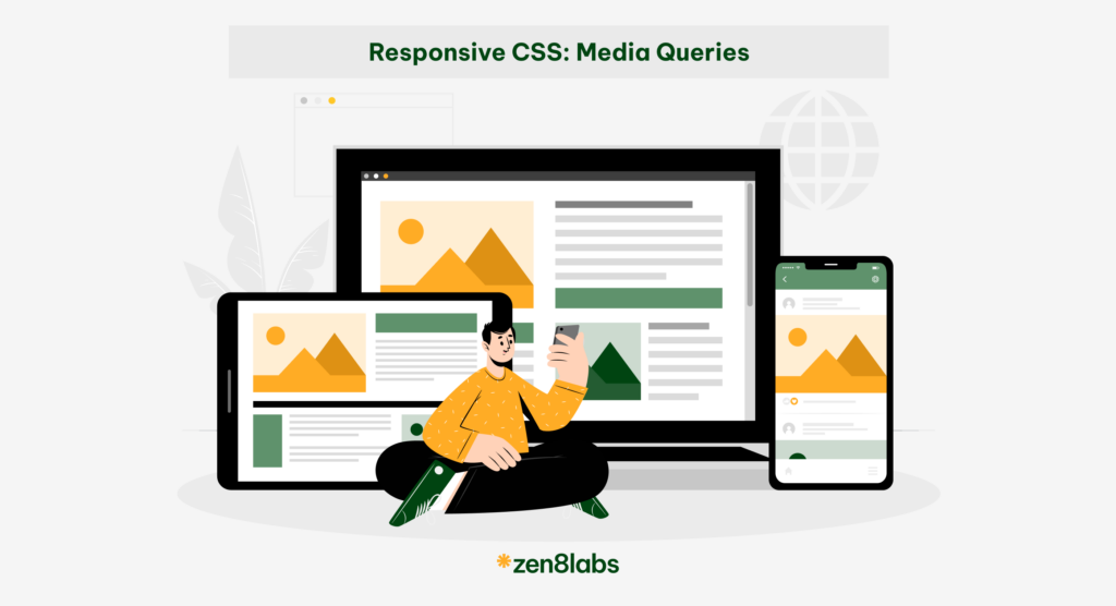
Our current world today has a lot of screens. And, these screens are getting smaller and smaller, from large computers to tablets like iPads and even to iPhones, which seem to get more compact with each version. For employees in the IT industry like me, it’s crucial for us to ensure that websites remain viewable and adjustable, making the viewing experience as pleasant as possible which is a part of my role at zen8labs. Understanding that there are different screens, CSS has introduced a powerful tool: Media Queries.
What are Media Queries?
To introduce the most understandably, Media Queries are one of the CSS features that allow you to apply different styles to your website based on the characteristics of the user’s device, like screen size, resolution, or orientation. This helps make your website look good and work well on various devices, such as smartphones, tablets, and desktop computers
How to use Media Queries?
There are 2 ways to use Media Queries:
External link:
<html>

  <head>

    <!-- Apply for all devices -->

    <link rel="stylesheet" href="style.css" media="all" />

    <!-- Apply for devices that have a width bigger than 400px -->

    <link rel="stylesheet" href="small.css" media="(min-width: 400px)" />

    <!-- Apply when trigger print function -->

    <link rel="stylesheet" href="print.css" media="print" />

  </head>

  <!-- ... -->

</html>
This HTML snippet includes three different stylesheets: one for all devices, one for devices with a minimum width of 400px, and one specifically for print formatting. The stylesheets are applied based on the media queries defined in the “media” attribute of each <link> tag.
Internal link:
@media only screen and (min-width: 375px) and (max-width: 767px) {

  .zen8labs {

    background: #ddd;

  }

}
This CSS media query applies styles only to screens with a width between 375px and 767px. Within this range, the .zen8labs class is given a background color of #ddd (light gray).
Media Queries Syntax
1. Viewport/Page Dimensions Media Features
@media [media type] (media feature) [operator] (media feature) {
  /* css here */
}
It consists of:
1.1 Media types
- All: Apply for all media types, the default value if there is no target media type
- Print: Apply when the webpage is printed or viewed in print preview mode
- Screen: Apply when using devices with screens, such as computers and mobile phones
1.2 Media features
- Width: This feature can be used as a certain value or as ranges, and therefore, be prefixed with min- or max- to indicate that the given value is a minimum or a maximum
@media screen and (width: 600px) {
  .zen8labs {
    color: red;
  }
}

@media (min-width: 375px) and (max-width: 767px) {
  /* style here */
}- Height: This feature can be used as a certain value or as ranges, and therefore be prefixed with min- or max- to indicate that the given value is a minimum or a maximum.
@media screen and (height: 800px) {
  .zen8labs {
    color: red;
  }
}
@media (min-height: 375px) and (max-height: 767px) {
/* style here */
}Notes: From Media Queries Level 4, we can use the new syntax, which is the same as the math operator (>, <, >=, <=, =)
- Aspect-ratio: This feature applies to a screen that has a ratio.
@media (aspect-ratio: 16/9) {
  /* style here */
}- Orientation: This feature allows us to test for portrait or landscape mode. A standard desktop view has a landscape orientation.
@media (orientation: portrait) {
  /* style here */
}
2. Display quality media features
To display quality media features you need the following:
2.1 Resolution
This feature describes the resolution of the output device, i.e. the density of the pixels, which can be used as a certain value or as ranges with prefixed min- or max-
@media (resolution: 300dpi) {
  /* style here */
}
@media (min-resolution: 150dpi) and (max-resolution: 600dpi) {
/* style here */
}2.2 Scan
This feature identifies the scanning process of the device, and how the device draws an image on the screen (where interlace draws odd and even lines alternately, and progressive draws them all in sequence).
Value: interlace | progressive
2.3 Grid
This feature identifies whether the output device is grid (e.g., a “tty” terminal, or a phone display with only one fixed font) or bitmap
2.4 Update
This feature checks the frequency at which the device can change the interface of the content (if possible), with values including none, slow, and fast.
@media (update: none) {   /* Used when the layout no longer changes after rendered */
}
@media (update: slow) {
/* Used when the layout is dynamically according to the usual rule of CSS*/
}@media (update: fast) {
/* Used when the layout may change dynamically according to the usual rules of CSS, and the output device is not unusually constrained in speed, so regularly updating things like CSS Animations can be used */
}3. Interaction Media Features
The features reflect various aspects of how the user interacts with the page
| Pointer: none | Pointer: coarse | Pointer: fine | |
| Hover: none | keyboard-only controls, sequential/spatial (d-pad) focus navigation | smartphones, touch screens | basic stylus digitizers (Cintiq, Wacom, etc) |
| Hover: hover | Nintendo Wii controller, Kinect | mouse, touch pad, advanced stylus digitizers (Surface, Samsung Note, Wacom Intuos Pro, etc) |
They help tailor the user experience based on the input method, enhancing usability and accessibility.
4. Logical Operators in Media Features
In media queries, we can use logical operators similar to those in many programming languages to select media types based on specific conditions. The @media rule itself acts as a logical operator, stating that “if” the following types and features match, then perform certain actions.
4.1 And
We can use the logical operators ‘and’ if the feature has value as a range (ex: width, height).
@media (min-width: 375px) and (max-width: 767px) {
 /* style here */
}
4.2 Or, Comma
We can also separate features with a comma, which acts as an “or” operator to match different features.
@media (max-width: 599px), (min-width: 1000px) {
 /* style here */
}
4.3 Not
We might want to select devices based on what they do not support or match.
@media not all and (max-width: 968px) and (min-height: 401px) {
   /* Styles for devices that are NOT:
     - 968px wide or less, or
     - 401px tall or more
    */
}
Conclusion
Media queries are essential for responsive web design, enabling us to adjust styles based on different devices and screen sizes. Using various media features and logical operators, we can create websites that look great and function well on everything from large desktop monitors to small mobile screens. This flexibility ensures a better user experience, making our websites more accessible and effective for everyone. If you have found this interesting, then check out our other blogs here!
References
https://drafts.csswg.org/mediaqueries
https://www.w3.org/TR/mediaqueries-4
Hong-Anh Nguyen, Software Engineer