Introduction
In the previous blog, The CSS Happy Learning Path, we explored the fundamentals of CSS, focusing on the cascade, specificity, and box model. However, understanding these principles is only half the battle—applying them effectively in real-world scenarios is where things get tricky.
This blog post is dedicated to applying the concepts we previously discussed.
Why some elements with a higher z-index are still behind others
Are you wondering why z-index still works without a position property? Or why some elements with a higher z-index still end up behind others?
This brings us to an interesting concept: Stacking Context. Think of it as an invisible layering system that determines which elements appear on top of others. But here’s the twist—whether a stacking context is created largely depends on the layout mode in play. Some layout modes naturally generate a stacking context, while others don’t. Additionally, certain properties, like isolation: isolate, can also force a new stacking context (check the full list [here]). These factors can lead to surprising results when working with z-index and positioning. Understanding this hidden mechanism is key to mastering how elements stack and avoiding those frustrating “Why is this behind that?” moments!
Every positioned element in this example creates its own stacking context due to its position and z-index. Here’s how they stack up:
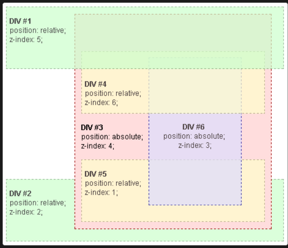
Stacking Hierarchy:
- Root
DIV #1(z-index: 5)DIV #2 (z-index: 2)DIV #3(z-index: 4)DIV #5(z-index: 1) → Rendered as4.1DIV #6(z-index: 3) → Rendered as4.3DIV #4(z-index: 6) → Rendered as4.6
Key Takeaways:
- Child elements stack within their parent’s stacking context.
DIV #4,#5, and#6are insideDIV #3, so theirz-indexvalues only matter within that scope. - Even though
DIV #4has az-indexof6, it’s still underDIV #1(z-index: 5in the root stacking context) because it belongs toDIV #3, which has a lowerz-index. DIV #5(z-index: 1) appears aboveDIV #2(z-index: 2) sinceDIV #5is insideDIV #3(z-index: 4), making its effective stacking higher.- Think of stacking like version numbers—parents define the major version (
4), and children get decimal values (4.1, 4.3, 4.6).
Stacking is like a nested priority list—mastering it means no more z-index headaches!
Does z-index work without position?
Consider This:
<style>
  .row {
    display: flex;
    gap: 16px;
  }
  .overlap.item {
    z-index: 2;
    background: rgb(105, 135, 255);
  }
  .row {
    list-style-type: none;
    padding: 16px;
  }
  .item {
    width: 50px;
    height: 50px;
    border: 2px solid;
    border-radius: 4px;
    background: white;
  }
  .overlap.item {
    margin-top: 4px;
    margin-right: -32px;
  }
</style>

<ul class="row">
  <li class="overlap item"></li>
  <li class="item"></li>
  <li class="item"></li>
</ul> 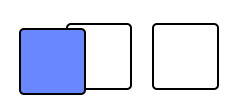
When an element is a child of a flex container and has a z-index value other than auto, it automatically creates a new stacking context—no position required.
Yep, flex items have special privileges when it comes to stacking. Normally, block elements need position: relative | absolute | fixed before z-index even starts paying attention. But flex items? They cut the line and immediately influence stacking order, no extra steps needed.
This little quirk can be a lifesaver or a head-scratcher, depending on whether you expect it. Ever found a flex item mysteriously floating on top of another? That’s flexbox doing its thing. So, when working with flex layouts (or Grid), keep this in mind—your elements might stack in ways you never expected!
When width doesn’t work as expected
<style>
  .flex-wrapper {
    display: flex;
  }
  .item {
    width: 1000px;
  }
  .row {
    list-style-type: none;
    padding: 16px;
  }
  .item {
    height: 50px;
    border: 2px solid;
    border-radius: 4px;
    background: hotpink;
    margin: 16px;
  }
</style>

<div class="item"></div>

<div class="flex-wrapper">
  <div class="item"></div>
</div> 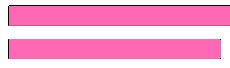
Our .item element has a single CSS rule:
width: 1000px; What happens in Flow layout?
In Flow layout, width is the law—no exceptions. If you say 1000px, it takes up 1000px, whether it fits nicely or bulldozes over everything else.
What happens in Flexbox?
Now, let’s drop .item into a Flex container. Suddenly, width isn’t so strict anymore. Instead of treating 1000px as a fixed rule, Flexbox sees it as a hypothetical size—the “ideal world” width that might shrink, stretch, or get overridden depending on available space.
Think of it like this:
- In Flow layout, the element demands 1000px.
- In Flexbox, the element politely requests 1000px, but the container has the final say.
Why does this happen?
It’s not that width is broken in Flexbox—it’s just following different rules. The Flexbox algorithm decides how much space to give based on flex properties, available room, and other elements in the container.
Moral of the Story:
Writing width in CSS is like making a wish—you need to know which layout mode is in charge to predict how that wish will be granted. 😆
Understanding Layout Modes conflicts
When Layout Modes collide: the unexpected battles of CSS ⚔️
CSS layout modes are usually friendly neighbors, but sometimes, they clash in ways that make your styles behave like rebellious teenagers. One of the most common conflicts? Flexbox vs. Positioned Layout.
The Great Escape: When Flexbox Meets Absolute Positioning
<style>
  .container {
    display: flex;
  }
  .absolute {
    position: absolute;
    width: 100px;
    background: rgb(105, 255, 110);
    top: 25px;
  }
  .item {
    height: 50px;
    border: 2px solid;
    border-radius: 4px;
  }
  .static {
    background: rgb(150, 105, 255);
    width: 50%;
  }
</style>

<div class="container">
  <div class="item absolute"></div>
  <div class="item static"></div>
</div> 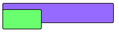
At first glance, you might expect .item to behave like a good little flex child—respecting alignment, spacing, and Flexbox rules. But nope! It completely abandons Flexbox like it never even existed.
Not all layout modes get along. Some take priority over others, and knowing which wins the battle will save you from hours of debugging. So next time your Flexbox layout is acting weird, check if a rogue position: absolute element escaped the system!
Conclusion: The never-ending CSS mysteries
CSS is full of unexpected behaviors and hidden mechanics, and understanding how layout modes interact is the key to mastering it. From stacking contexts to conflicting layout modes, every CSS rule works within a larger system—one that isn’t always obvious at first glance.
But now, you’re armed with the knowledge to debug these quirks! The next time z-index ignores your command, position: sticky refuses to stick, or flex-grow and width start fighting, you’ll know where to look.
Still scratching your head over CSS? 🤔
Here are more CSS mysteries worth exploring:
❓ Why do flex-grow and width sometimes conflict in flexbox?
❓ Why does height: 100% not always work as expected?
❓ Why does position: sticky sometimes refuse to stick?
❓ Why does overflow: hidden mess with my absolute positioning?
❓ Why does transform: scale(0.5) make my text blurry on some screens?
❓ Why does display: inline-block create unexpected white space?
The best part? CSS is a puzzle worth solving. And with each weird quirk you uncover, you get one step closer to becoming a true CSS wizard.
So, keep experimenting, keep questioning, and most importantly—have fun breaking and fixing layouts! Stay tuned to the zen8labs blog for more expert insights into IT, web development, and beyond!
Hung Phung, Software Engineer Intern